Support This Site

Wednesday, May 28, 2008

Planet Platformer


I had never really intended to review Planet Platformer as I didn't see it as that bad a game. Infuriating, perhaps, but certainly not awful. That was, of course, until I played it again recently, and realised just how much a few bad mistakes can impede one's enjoyment of a game.
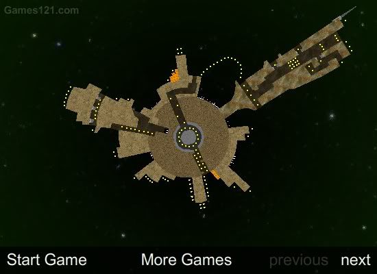


Planet Platformer pretty much does what it says on the tin. There are a number of planets (three, to be exact) and you have to guide your little character around the planets collecting stars, before blasting off to the next level. With only three worlds to overcome, you'd think the game could be completed in under ten minutes. The developer of Planet Platformer has tackled this problem by making sure the controls are shot to hell and that each level is an annoying, boring mess.
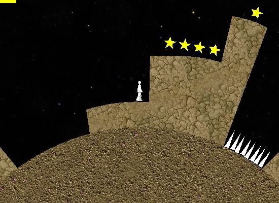


It's not like the concept can't be any simpler - collect stars; escape planet; repeat - so why isn't it as straightforward as that? It certainly seems like no big deal when you start out, jumping across platforms, avoiding spikes and collecting stars. I did notice that the game would momentarily stall whenever I picked up a new star. You've all seen that at some point or another - sometimes so much is happening on screen, there's a split second pause before the action continues. This also happens when you've been too God damn lazy to make sure everything runs smoothly. If this were a processor-intensive first person shooter, I would understand, but this is a 2D 8-bit platformer starring a rectangle with legs.
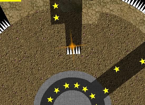


Vigilance is key, and a lapse in concentration can find you meeting the business end of a steel spike. At this point you explode. Don't ask me why - perhaps the protagonist is a robot. Yeah, that's it. Don't expect any extra lives - you get one shot to complete the level, and if you die it's back to square one. Remember that when you've just completed the hardest part of the level, only to mistime a jump and land in some lava.
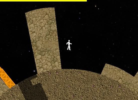


Some parts of the game are a lot of fun, especially in Level One when you have to run around the planet's core on your way to the other side. But once there, you find yourself in a predicament that repeats itself throughout the game. Having gotten past a batch of spikes and those wonderful metal barriers that like to open and quickly shut to the detriment of your head, I found myself on another part of the planet, ready to snatch the last of the stars. But here I had a problem. You see, there were some stars on the right side of this tall column that I hadn't been able to get to earlier. I had no choice but to jump over the column to collect the stars - and found myself back where I started. I then had to go through the same obstacles all over again, just so I could get back to the last of the stars. In other words, I had to complete the level twice.

Now here's a newsflash, game developers - people don't generally like having to backtrack across an entire fucking level, just to pick up a star that they couldn't jump high enough to reach.
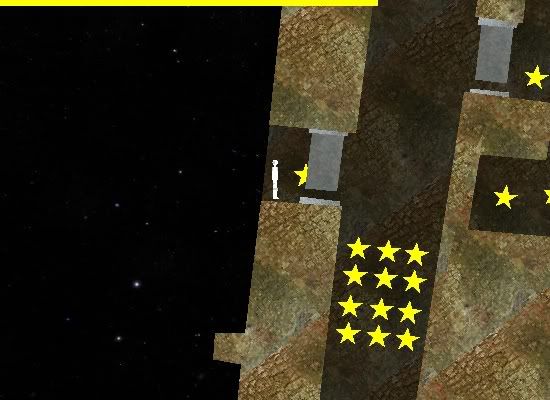


You know what else people don't like? Having to stand in one potentially fatal spot, just so they can jump to another potentially fatal spot, then having to haul ass before getting crushed. Because you absolutely must get every star to complete the level, this is a process I had to repeat numerous times.
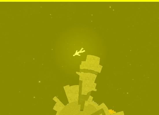


The good news, at least, is that it is possible to beat the levels, just don't expect to do it easily, what with controls that are unresponsive one minute, ultra sensitive the next, and a dozen different traps that are all designed to kill you when you least expect it. And good God, but doesn't that yellow screen give you a migraine? Jesus!
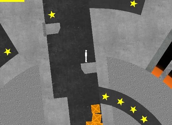


Level two is no easier - indeed, the learning curve shoots up exponentially. From the very beginning the player is forced to work their way around myriad traps and obstacles. First you have to jump out of this pit (not easy when half the platforms retract every two seconds)...
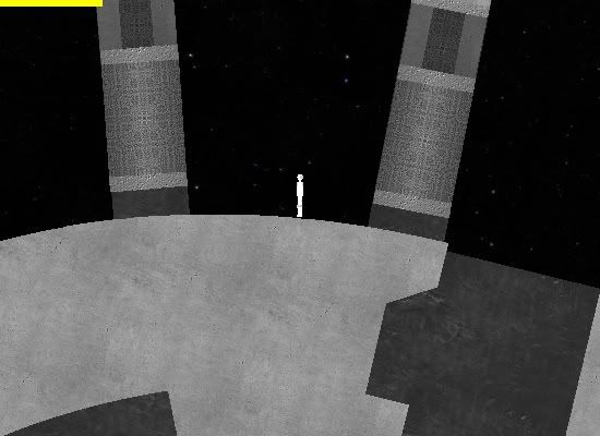


...Then you have to sneak through these giant falling barriers...
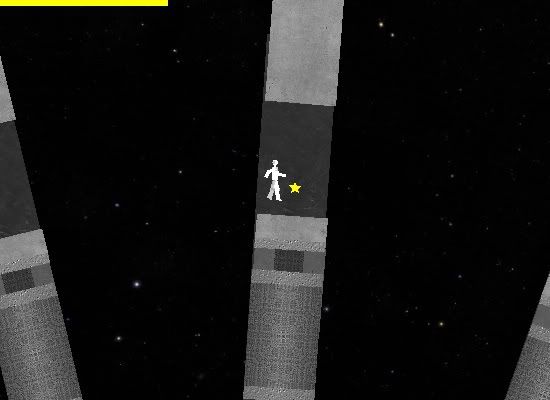


...Jump across a set of platforms - twice...
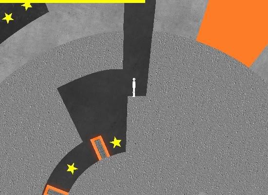


...All to get to this hallway, guarded by laser walls. It should come as no surprise that this hallway leads back to the very beginning of the level, but I wasn't able to just walk through it from there because the lasers are moving from right to left. So I jumped down to collect the stars, and promptly died.
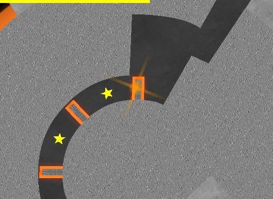


Great. That whole section pretty much sums up the entire level, so lets go straight to the final planet.
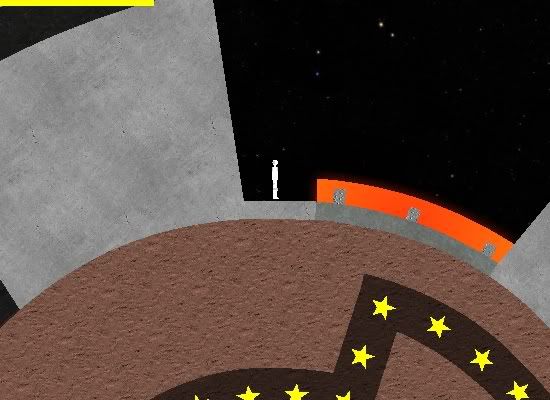


Oh, a laser platform. Not just a laser wall, you understand, but an actual platform that flares up every few seconds. I think we all know where this was heading, but here's a visual clue for you regardless:
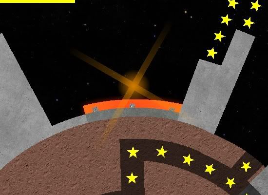


Which was when I realised there were more productive ways to spend half an hour, like watching grass grow. Like I wrote at the beginning of this review, I didn't hate Planet Platformer when I first played it. But now that I've played it repeatedly, only to face disappointment at every turn (compounded by the fact that, without a save feature, you have to start from the beginning every time you play), it has worn down my resolve. If this game were a Russian dog I'd have shot it into space and left it to die already (nonsensical space-related joke.)

Wednesday, May 21, 2008

Miley's Naughty Pics


I was going to review Miley's Naughty Pics last week but figured I would wait until the Miley Cyrus Vanity fair pictures were even less of a hot news item before doing so. Plus, last week's review was my first to appear on Way of the Geek, and I didn't want to come across as some kind of pervert in my first post. Now that I'm two weeks in, I figured coming across as a pervert would be fine.

I could rant long and hard about the furore created by Miley Cyrus appearing naked on the cover of Vanity Fair magazine, so I will. Quite frankly, that so many people got so upset by the image of a fifteen year old girl's back boggles the mind. It's almost as if people didn't realise that

1) Miley Cyrus is growing into a young woman; and
2) It was her fucking back.

If this is the reaction to a tasteful, artistic photograph, taken by an influential and well-respected photographer, what would the reaction have been to something truly shocking, like Miley naked, legs spread, with Scarlett Johansson between her thighs? Well, for one thing, I'd have become a lifetime subscriber to Vanity Fair, but that's beside the point (ahem.)


Anyway, I suppose I should review the game. Miley's Naughty Pics is an exact replica of another title produced by Addicting Games called Vanessa's Naughty Pics. Seriously, the only difference is the name in the title. I don't want to rip into Addicting Games too much, because they host some pretty entertaining stuff, but guys, come on - that game sucked the first time round. Do you really think changing the girl to someone who actually exists changes anything?

So, you play a paparazzo assigned with the task of taking photos of Miley Cyrus when she's at her most vulnerable, all in exchange for cold hard cash. Wow, way to make a sympathetic protagonist. You have a short amount of time in each level to take five pictures, and your goal is to make as much money as possible, so you can get to the final "money shot" of Cyrus modelling nude for you. Because somewhere along the way you went from being a scumbag with a camera to a real photographer.


Once you've received word of where Miley is going to be, you need to haul ass and take the pics. This is easily done with the mouse, clicking on Cyrus when you get her in shot. But be careful not to get her dad in the frame, or else it's game over! Personally, I think if Billy Ray Cyrus got caught by the paparazzi he'd be elated. I mean, "Achy Breaky Heart" and then years of watching your daughter make more money than you ever did - that's gonna hurt a man's pride.


Looks like we did good - there's the photo on the cover of Manatee Hair (see what they did there? Clever, wasn't it? No, it wasn't.) Which means we get more jobs and more chances to stalk and photograph a fifteen year old girl. The paparazzi get paid to do this. My uncle did it for free and he got sent to prison. (I kid, of course - he took pictures of boys.)


The next task is to photograph Miley relaxing in her living room. Woah, how the hell did you get in there? What teenage girl decorates her living room like that? And who the fuck is this guy posing on the floor? Sadly, we never learn the answer to these questions, nor the most important one at all - why did I play this game? Why, God damn it!?


And so it goes on and on, following Miley Cyrus around and photographing her when she's committing such heinous acts as eating sweets and sitting in her living room. Damn, for a supposed teenage tearaway, Miley Cyrus is pretty boring, isn't she?


What I find funny is that the editor of Manatee Hair thought nothing of my picture showing Miley French kissing another girl, yet she eats one lollipop and she's suddenly "completely wild." Next thing you know, she'll be touching the white stuff - that's right, sherbet!


And then that's it - after only three levels, it's time to go to the photoshoot and convince Miley to pose nude. I have some concerns, however. For one thing, that looks nothing like Miley Cyrus. I've seen pictures of Miley Cyrus, and not just the ones of her naked. This chick looks like some girl who just got off the bus from Arkansas and who dreams of becoming a big star, but who will spend the next six months acting as a fluffer on gonzo porn shoots.


By saying the right things to "Miley", you can get her to remove her clothes and strike that now infamous pose. If anything, this game proves just how utterly ridiculous it was that so many people took umbrage with the original photo. Not to mention, that's the worst rendering of the naked human form that I've ever seen outside of a twelve year old's notebook.


Someone's notion of what constitutes a "money shot" is different from mine, but whatever. I'm just glad the game and this review is over, so I can pretend like it never happened, just like Disney executives. I feel almost as embarrassed as Miley did by the Vanity Fair photos. But just like Ms Cyrus, I understood damn well what I was doing, and now I'm just going to have to deal with the consequences. Readers, don't be the Lindsay Lohan to my Britney Spears - learn from my mistakes, and don't play this pathetic, amateurish, moronic game.

Wednesday, May 14, 2008

Wild 'n' Free


The full title of this game is Wild 'n' Free - A True Story, though I have the niggling feeling that this is much like how Fargo was a "true story," because if the events of Wild 'n' Free actually happened (or ever do happen, for that matter) I'll be amazed.

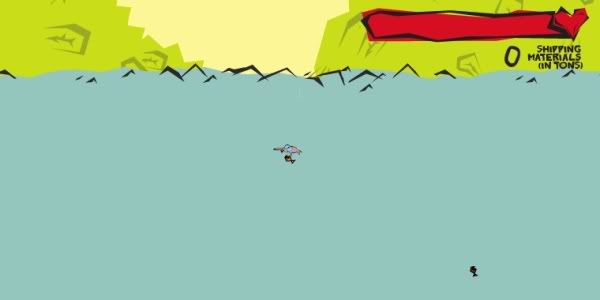
I'll no doubt be left very confused, too. There is no plot or even an attempt at a plot. There isn't even a Start button. The title screen pops up, fades out and you are immediately thrust into the thick of it, the only concession to instructions being four arrows. So at least we know that the arrow keys move our character. Now, if only we could determine what exactly the character is.


At first I thought it must be a swordfish, what with the long straight nose. But why is it pink, and why is it apparently wearing a swimming cap?

Also, why is it so small? The sea dominates the entire screen, leaving us to control a tiny, strange-looking... thing. There isn't really any reason why the fish mutant we're calling the hero couldn't have been a little bigger.


Fish monster thing can zip through the water with great ease, no doubt aided by its swimming cap, and is able to leap high into the air. Its ability to jump seems to be the only thing going for it, and the player can't turn or pivot in the air, so it sort of loses its lustre after a while.


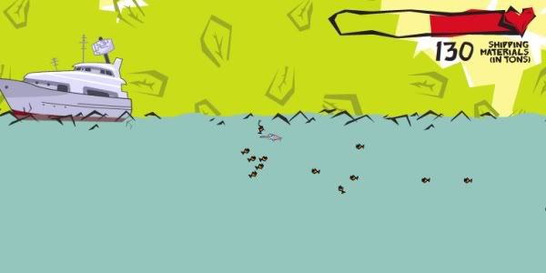
Fish mutant is also some kind of Pied Piper type, attracting any fish it comes across. This is actually kind of cool to watch, as the shoal of fish gets ever larger and starts to number in the dozens. But I still had no idea what the object of the game was, or how I was supposed to go about achieving it. I figured I had to go about collecting "shipping materials", but what the hell did that mean?


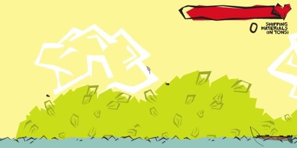
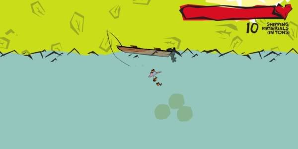
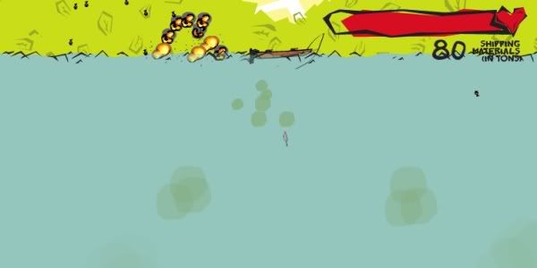
The answer came in these boats, trundling along on the surface of the water, releasing an oily, smoky substance that caused no end of physical discomfort to our deformed hero.

And it was here that I finally realised Wild 'n' Free is an environmental game, designed to show the terrible damage being brought upon marine life at the hands of man. Our hero must be some kind of sea nymph, attracting the creatures of the ocean and leading them in the fight back against the wasteful humans. But what could they do?


How about blowing up the boats?

You know, I've seen a lot since I started reviewing crappy online games, but this gets serious points for originality. The little sea nymph mutant creature leads his army of kamikaze exploding fish against the forces of man. Give it more points for irony, since wouldn't sacrificing dozens of fish and sinking boats that are spewing waste into the sea sort of defeat the purpose of their mission - that is, saving marine life?

I'm just sayin', is all.


The longer you play, the more varied the boats become, among them these yachts that fire off sonar waves, which our hero also doesn't like. I work with children who are sensitive to sound. Most of them just cover their ears and cry; they don't strap TNT to a bunch of fish and then go around blowing up everything in sight.

All in all, Wild 'n' Free is by no means the worst game I've ever played, but then I've said that about a lot of games that I've reviewed and they've all pretty much sucked. This one is actually quite intriguing for the first five minutes. Of course, this is partly because you have no idea what the hell's going on, but still, it kept my attention. However, actually trying to destroy the boats can be difficult and stressful at times. You lose health so quickly that you have to constantly swim down to the ocean floor and chew on some plants to regain your energy, which is also a pain in the ass.

I suppose if you want to play a game that says something about the environment, you could do worse than Wild 'n' Free (though if I were you, I'd play Decorrupt the Deforesters, which allows you to beat the shit out of loggers.) While the controls are simple and responsive, and the animation (that I could make out) well-drawn, Wild 'n' Free just doesn't have enough going for it to keep me coming back for more.

Wednesday, May 7, 2008

Desert Ambush


There's a distinct feeling of deja vu here, like I've played Desert Ambush before. Which I haven't, of course, but that niggling feeling still remains. Perhaps it's because I used to play a lot of games like this, with lone warriors fighting the world, before I got old and boring and only wanted to play Peggle. Unfortunately, Desert Ambush does not bring back any fond childhood memories, save for those times when I sat down to excitedly play a brand new game and walked away ten minutes later because it was a load of ass.


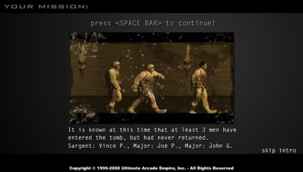
The year is 1997 (?) and three brave soldiers have disappeared while investigating an ancient tomb. One of them looks remarkably similar to the character you'll be playing. Maybe they're brothers. Yeah, that's it. They're certainly not the same generic model with different outfits.


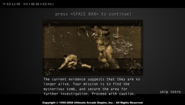
"The current evidence suggests that they are no longer alive." No, I'm willing to bet they're not. Something about this picture of the Sergeant getting torn to shreds by an eight foot tall demon tells me that they didn't make it. On a side note, isn't it cool how the soldiers didn't have real last names, only initials? That's so hip.

Anyway, your character is sent to secure the area. Alone. No back-up. Just you and a tomb full of monsters. Because three guys worked so well, why not send just one?


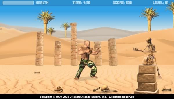
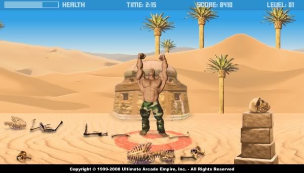
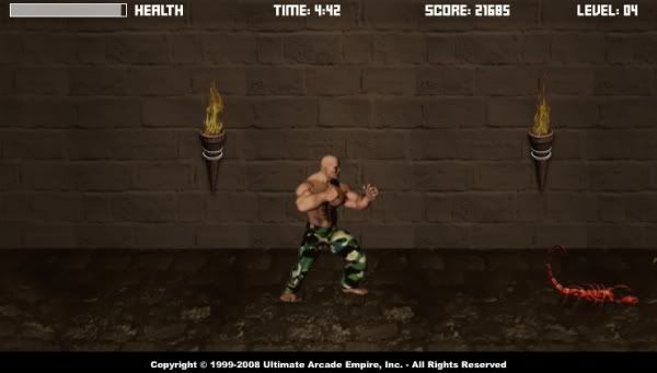
Here is your character, Chuck Manly (I don't think he has a name, but that one will suffice.) Chuck, who is totally not on steroids, is such a badass that he's going to fight the armies of hell barefoot and with nothing but his fists and feet for weapons. I don't know whether to sigh in total embarrassment for Chuck or pump my fist in the air and scream, "WHOOOOO!!! U.S.A.!!!!!" but I'm willing to bet it's not the latter.


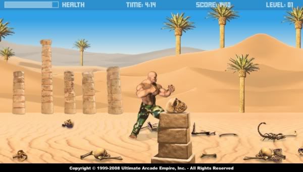
Chuck makes mincemeat out of everything except the giant scorpions. This is why you don't walk barefoot in the desert, Chuck! For some reason, skeletons who blow poisonous smoke and box aren't a problem, but those scorpions will kick your ass!

Which brings up another question - skeletons have no lungs, so how the hell are they blowing black smoke in my face?


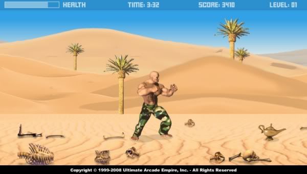
In every level you'll find one of these lamps (there are also water jars to regain health, but who cares?) Once you have one of these you'll be able to temporarily enter Genie/God mode, granting you invincibility for a short amount of time.


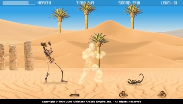
Yeah, watch me go transparent on these fuckers. I would have thought, however, that with a genie you could have asked for more than fifteen seconds of invincibility. At the very least, some kind of slapstick joke and a few pop culture references would have been nice. But no. Not even a Robin Williams cameo.


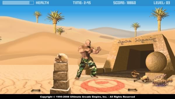
We did it! YEAH! We reached a completely out of place red target on the ground! I know that's nit picking, but nitpicking is what I do.


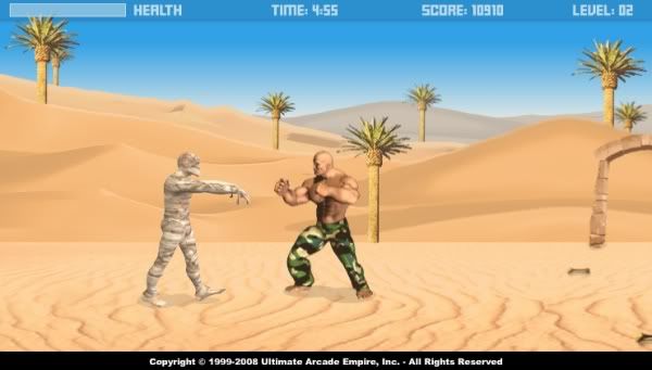
Things get a little more interesting with the addition of mummies, who are able to take away large amounts of health very quickly. This would be more impressive if they weren't total pussies that could be defeated with a single punch or kick. They even make some wimpy whining sound as they're kicked offscreen by our intrepid, moronic hero.

That's another little problem - the controls. it's not that they're bad, it's just they seem a little like overkill to me. You've got the usual arrow keys for moving, ducking and jumping, but then you have four attack buttons, one for each limb. Why? Players are just going to use the same two buttons over and over. That's time wasted - time that could have been spent making scones, Semtex or a better game.


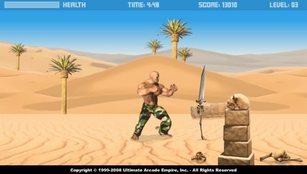
On the one hand, these swords that shoot up out of the ground are pretty cool. On the other, they're about as dangerous as the skeletons and mummies, so you're really only at risk when you've got a whole bunch of monsters ganging up on you, or if a scorpion is nearby (scorpions being, of course, the only real threat in Desert Ambush.)


Yay, we've reached the tomb! After three levels of repetitive desert landscape, we now get two levels of repetitive dungeon hallways. What fun!


Again, the scorpions are the only real threat. There may be more of everything else, but they're still manageable. Those little buggers scuttling across the floor are not. The scorpions inside the tomb are bright red, most likely because the regular ones would have been impossible to see in this murky colour scheme.

OK, look. I could keep going. I could have played until I reached level 5, so you could see the demon, but you've already seen him in the screenshot near the start of the review, ripping into a far smarter soldier than Chuck. The truth is, I died on Level 4. With no pause button, I had to quickly go from my web browser to my art programme and back again to get all the screenshots I needed, which left me vulnerable. Once I died, I was faced with the prospect of starting all over again. And quite frankly, I couldn't be arsed. Desert Ambush is a slow, ponderous affair, which only picks up in the last level, and this is only because you've got a frickin' demon running after you.

It's got some nice graphical touches but it plays like a piece of crap and you'd have to really love this sort of thing to play it through to the end. I wouldn't even suggest it as a time waster, because the levels take so long to load. A whole bunch of stuff got thrown into Desert Ambush in the hope that the result would be a brilliant game. But if you put enough crap in something, it's just going to stink.