Support This Site

Wednesday, December 19, 2007

James The Christmas Zebra

(This is the second of two reviews today. The first can be found here.)


There are times when I ask myself if I'm far too hard on what are essentially simple little games designed to kill some time. Looking back on the games I've reviewed over the last few months, it's not like any of them were completely, utterly, totally awful, right? (Well, maybe Bomb.) As a gamer, I have a right to be entertained, but developers have the right to make their games without jerks like me ripping their hard work apart.

But then I play a game like James the Christmas Zebra, one of my favourites, and I have to ask myself, "Why aren't these other games as enjoyable as this?"

And the answer is, "Because they're shit, and I do have a right to rip them to shreds, so fuck you." Or something like that.

Anyway, onto the review. James the Christmas Zebra (best title ever) is a remarkably fun game that first appeared a year ago. It proved so popular that the developers, The Super Flash Bros., have made new additions to the series, sending James to the circus, to the beach, and even into space.

The premise is absurd, but then that's what makes it so great. You play the titular James, a zebra who can catch stars from the sky and swing from them.


Just like that. You have two minutes to run and swing your way around the playing area, collecting cookies "because they're yummy."


You need to avoid the puddings, because 1) they're fattening, and 2) they explode, taking points with them. At the end of the game, the Newgrounds tank appears. James hops in and drives away.

No, seriously.


After which you can submit your high score, play again, or go back to the main menu. My advice is to head back to the menu, because once you've played the main game, two mini games will be unlocked forever! They're equally as fun, i.e. lots.


In Long Jump you attempt to fly as far as possible on the strength of a single swing. The idea is to hit cookies to keep going and avoid the puddings which will slow you down. It takes a little practice, but once you have the hang of it you can achieve a decent score.


In Time Attack James needs to get from one side of the playing field to the other in the shortest time possible. But watch out for puddings, as each one you hit will add a couple of seconds to your time.

These mini games compliment the main one without detracting from it. Indeed, they're great little games in their own right. The graphics are cute without being nauseating, and the controls are simple yet effective. It's obvious that the developers had a very clear idea of what they wanted to achieve, and set about doing so in the simplest way possible. the result is a game that looks great, plays like a dream and is incredibly good fun. If you enjoy James the Christmas Zebra, then check out the other games in the series, as they're equally enjoyable.

OK, that's my one nice review of the year done. Normal service will resume in 2008. Happy holidays, and I'll see you in the new year.

Christmas Zombie Defence


A special treat for all you Big Mean Flash Gamer fans - I will be posting two reviews today, as I will not be updating the blog at all next week. And in the spirit of goodwill, my second review will be of a game I actually *gasp!* like for a change.

But before I start fawning over a good game, I want to tear apart this very bad game - Christmas Zombie Defence.

Now, regular readers will know that I'm a big zombie fan, so a title like Christmas Zombie Defence... shit, that's the best title ever! Could you imagine the possibilities? Santa Claus with a katana in one hand and a .22 rifle in the other, blasting away at zombified elves in an effort to save the North Pole and Christmas for everyone. Hell, I could play that game all day!

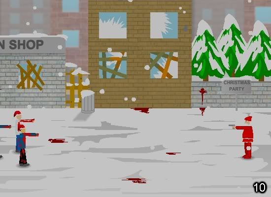
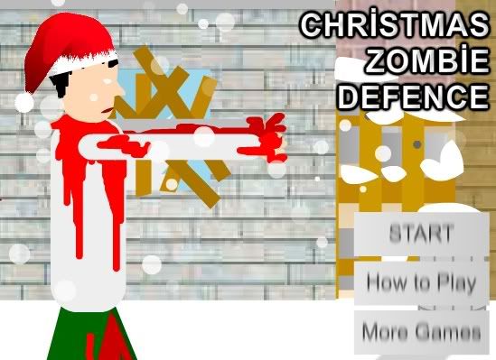
Unfortunately, Christmas Zombie Defence is not that game. Basically, this is just a stripped-down version of regular Zombie Defence, but you play Santa, and all the zombies inexplicably wear Christmas hats.

Was I disappointed? Yeah, a little.


So these stick figure zombies walk towards you, and you shoot them with your gun. And for a handgun, it's got a hell of a range - in the early stages of the game you'll be clearing zombies right off the screen. Either that or Santa is one hell of a shot. But then, when you live in an area surrounded by polar bears, you gotta be tough.

The gun also has the longest clip known to mankind, as there's no need to reload, and your ammo is seemingly infinite. The result of this is that you can just run your mouse pointer up and down the screen, constantly clicking the left mouse button and mowing down everything that moves.

Oh, before I forget - the plot of the game (yeah, it has a plot) is that there's a party going on, and you have to defend it from the zombies. Let's just think about that for a moment. The zombie apocalypse has arrived, and people are more worried about getting their share of the eggnog. We are so doomed.

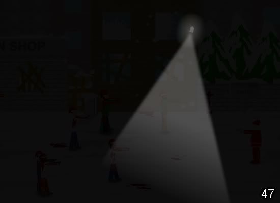
They must be partying pretty close to the Arctic Circle for Santa to be involved. Also, it gets dark frequently and quickly.


I'm guessing this is to add an extra challenge (or just a challenge, period)? It probably would have worked better if I wasn't still able to see everything, or if I wasn't just repeatedly firing in every direction anyway. You know what would have made this challenging? Limited ammo. You know, like in pretty much every other zombie game on the planet!

So what we're left with is a crappy-looking timewaster. And it doesn't even do that properly. You see, even little games that you play on your coffee break should have a point to them. There should be something to aim for - a crossword to complete, a puzzle to solve, a high score to attain. Christmas Zombie Defence provides none of those things. All it does is give you the opportunity to shoot zombies. Lots and lots of zombies. In silly hats.


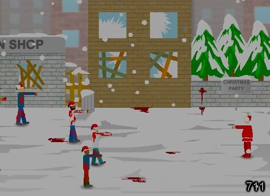
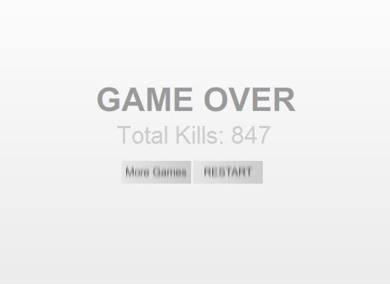
711 zombies and I wasn't even trying! The only reason the game ended was because my finger was getting tired, and I'm not risking a hyperextended index finger for this piece of shit. Which leads me to another gripe - the Game Over screen is generic. I know I'm nitpicking, but it's really nothing more than a grey background with darker grey writing on it, and really that just won't do.


I didn't waste ten minutes of my life to see something that was made by an idiot with a copy of Paint Shop Pro who's just figured out how to use the Blur command. If you must play a Christmas zombie game... why would you want to play a Christmas zombie game? Didn't you just read this review?

Sunday, December 16, 2007

Half-Life 2 Flash Version


This is just wrong.I don't know what I find more depressing: that someone took the time to make this piece of shit game, or that I played it three times to get all the screenshots. Regardless, we both wasted too much time on this ridiculous mess.

Much like the last game I reviewed, Zelda Mini Games, Half-Life 2 Flash Version takes inspiration from the phenomenally successful Half-Life games. And much like Zelda Mini Games, this takes its great origins and pisses all over it.

I don't know why it's so hard to make good online versions of console games. For every Portal, it seems, there are a hundred awful knock-offs that do nothing but waste your time and ruin any enjoyment the real game may have given you. Half-Life 2 Flash version is a perfect example of this. It looks and plays like it took the developer twenty minutes to make it.

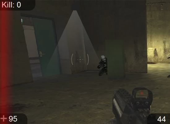
If its sole reason for existing was to be a little time waster for Half-Life fans, then perhaps it does the job. You have the regular 100 health points and a gun that can carry 45 bullets in its clip. Not that this matters, as you reload automatically and you have a seemingly endless supply of ammunition. Once you start, you'll be presented with a screen that looks pretty much like this:


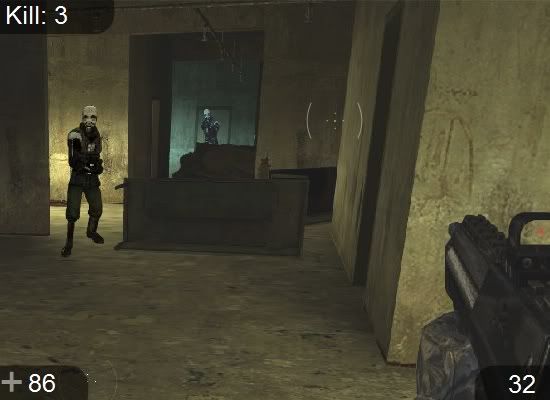
The enemies are clearly nothing more than cut and paste jobs. They don't move but rather slide into a fixed position and then stand or squat completely still as little flashes fly from the general area of their weapons. You put your crosshairs over them and click the left mouse button to shoot. Then you scroll over to the other side of the playing area:


And here you'll find more cardboard cutout aliens to shoot. You do this repeatedly, scrolling from one side to the other. There are no levels, no power ups and no other enemies. Nor do you have any way to defend yourself from their bullets, so you pretty much just stand there and get shot to pieces. But then they do the same thing, so it would hardly be right to give you an unfair advantage like a shield or a box to hide behind.


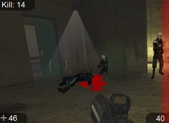
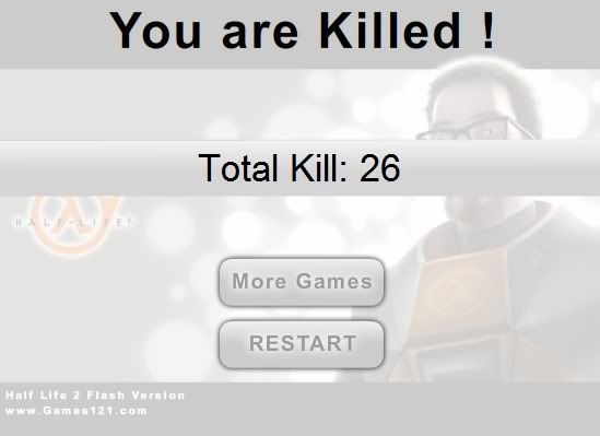
Oh, for the love of God... look at that blood! I've seen more realistic pools of claret created in MS Paint. Thankfully the game only lasts around three minutes. Eventually you die, whereupon you receive a final score and the opportunity to play again! Whoooo!


Twenty-six kills. I probably would have gotten more but the aliens had some kind of invisible helmet on that meant it took at least two head shots to bring them down. On the bright side, their alien anatomy meant they had vital organs in their knees, so a few shots to the legs were also deadly. (And yes, before you ask, this is sarcasm.)

As awful as Half-Life 2 Flash Version is, it's not nearly as depressing as knowing there are five more games just like it. Yeah, there's Flash Halo, Flash Call Of Duty, Flash Counter Strike... and they all equally suck balls. It's the exact same game, with few differences other than the surroundings and the enemy. Unlike other games that I've reviewed, there's nothing to commend here in the slightest. Half-Life 2 Flash version looks like shit, it plays like shit, and it's as fun as a dried up dog turd.

It's a really bad game.

Thursday, December 13, 2007

Zelda Mini Games


Apologies for the late update - I was visiting my mum before Christmas (I get the snarkiness from her side of the family.) But now I'm back in the saddle with a game that promises much but delivers bugger all.

A title like Zelda Mini Games has to give you some hope, right? After all, The Legend of Zelda is a wildly popular and much-loved video game series. Unfortunately, the developer (who goes by the wicked cool screen name of chtfreak64) has fucked up royally on this one.

First of all, I know it's not a big thing and really I should focus on the gameplay rather than the aesthetics, but would it have killed the guy to make a nicer title screen? I know squat about programming and even I could have done a nicer job with Paint and some clip art. If he had been spending that time on making some good games, I suppose I wouldn't mind as much. But it seems like this particular loaf was squeezed out in an afternoon between playing Ocarina of Time and jerking off to naked pictures of the Princess.

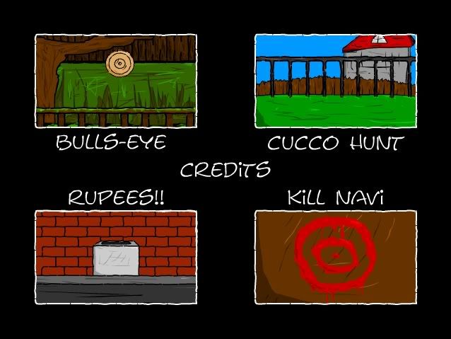
For one thing, all four mini games are shooters. Would a little variety be too much to ask? If you were just going to have four shooting trials, why not make it one big game rather than this "mini games" bullshit? Anyway, I'll run through each of them, starting with "Bullseye."

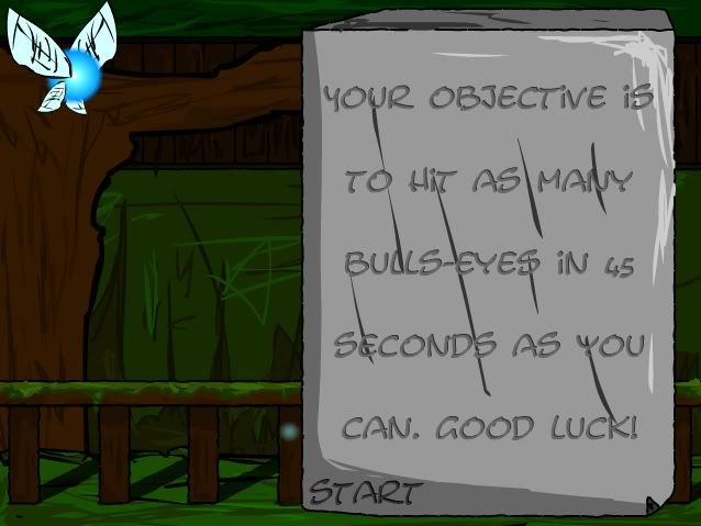
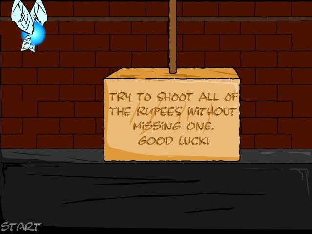
Oh, I should also mention that when you start the games you get this .wav file of an annoying Japanese kid yelling, "Listen!" And then you read the rules of the game, supporting my theory that the migraine-inducing little brat is only there to piss you off and remove any last hope that you are about to play an enjoyable game.


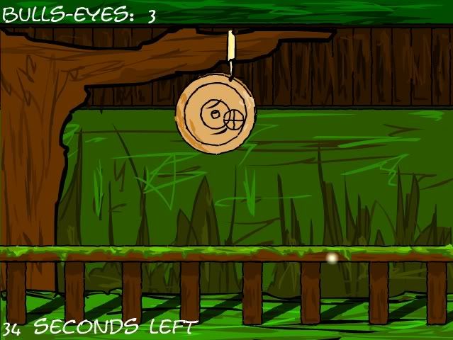
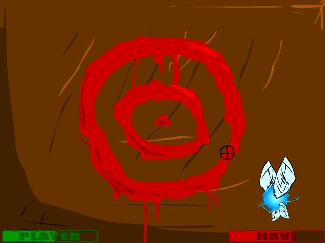
OK, "Bullseye." It's very simple, really: fire at the target as it swings and score as many bullseyes as possible. And before you ask, no, the target doesn't move up or down, nor do any slide across the screen or pop out of the background, like they do in most other games of this type. All you get is that one target, swinging back and forth. And for something so ridiculously simple, it's mind-numbingly hard to do. The target moves so quickly that there's little point in trying to follow it, so your best bet is to leave the crosshairs in one position and keep clicking the left mouse button every time you think you can score.


Are we having fun yet? The answer is fucking NO! After forty-five seconds you can find out how well you did.


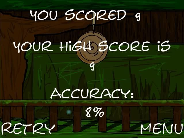
8% accuracy. Who knew trying to shoot a five millimetre wide circle moving rapidly laft and right could be so hard? And the awful thing? It gets worse as we move onto "Cucco Hunt."


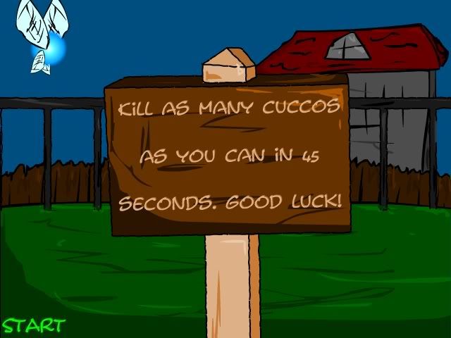
OK, confession time. I'm not a big Legend of Zelda fanatic. I like the games, and I respect the series' place in gaming history, but as a Sega owner in my youth, I was never too familiar with them. So you'll have to excuse me when I saw this game and immediately thought, what the fuck is a cucco?


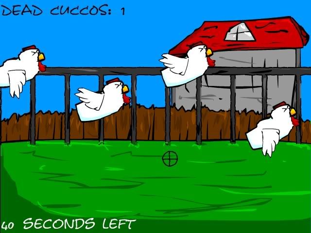
Oh, OK, it's like a chicken, or something. So can you answer another question I have? Do cuccos need to be shot in one particular part of their bodies in order to kill them? Because I was unloading on these fuckers as they flew past and I didn't kill squat. Either cuccos are hardcore tough birds, or the hit detection in this game is so bad it boggles the mind. I can't help but wonder if chtfreak64 simply took the code from "Bullseye" and, instead of having one tiny target swing left and right, had several dozen tiny targets fly across the screen.


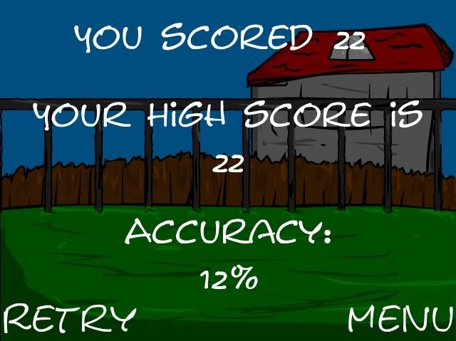
Don't ask me how, but I managed to take down twenty-two cuccos. What can I say, I'm persistant.

After that comes "Rupees!!", the two exclamation points included to piss off English professors.


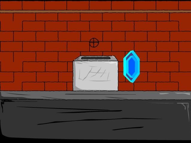
It's more of the same bullshit, really. Giant brightly coloured diamonds (or rupees!!) appear on screen and you have to shoot them.


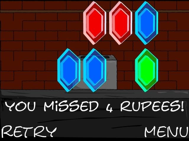
Yawn and fucking yawn. At least this game is a little different, and it doesn't last as long as the first two. Strangely, rather than give you a score of how many rupees!! you did hit, the game would much rather tell you how many you didn't.


"You missed 4 rupees!" Wait, what about the six I hit? Don't they mean anything? Or maybe that's just another example of how I came close and then failed miserably, huh?

Shit, why doesn't this game tell me how it really feels? "You missed 4 rupees! You suck at this game! You suck at life! You're the reason your parents divorced! Everybody hates you! Burn in hell, you waste of oxygen!"

Or maybe not.

Finally - thank God, finally - there's "Kill Navi." Yeah, fuckin' kill him. Or her. Or it. Or... who cares?


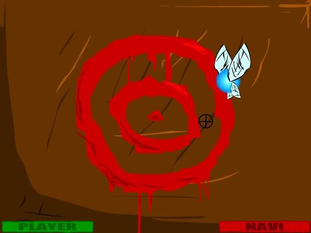
Navi is the fairy creature that helped you in the other games by showing you the rules. Now, to show your gratitude, you're going to shoot it. Nice.

Unfortunately, Navi is hard as nails. It takes a few dozen shots to kill it, and it flies around the screen at great pace, appearing on the opposite side of the playing area every time it flies away. Combine that with a gun that can't shoot straight, and I'm surprised I've ever beaten this game. Also, every ten or fifteen seconds, Navi stops and shocks you with waves of electricity!


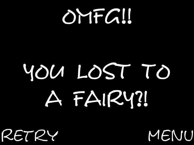
For something so small, it packs quite a punch - all it takes is three or four of those shocks to kill you. I've been killed so many times by that fucking fairy, it's embarrassing. On top of that, the developer rubs it in my face.


That's not a fairy - that's Chuck Norris with wings! That's Steven Seagal in a blue orb! That's John McClane yelling "Yippee ki-ay motherfucker!" as he blasts my ass back to the Stone Age! That fairy is a bad ass!

It's just a shame the fairy is in such an awful, awful game. Wait, that's inaccurate - it's in four awful, awful games! chtfreak64 is no doubt laughing his ass off as Zelda fans around the world load this game up on their computers only to watch the series they love bastardised for a bunch of shitty shooting games. They will not be held accountable for their actions.

Sunday, December 9, 2007

Woman On Top


No, this is not an attempt to include some titillating trash into the blog - this awful game with the awful double entendre of a title features nothing more risque than a kiss on the cheek. In saying that, if you have some masochistic tendencies, Woman On Top is the game for you.

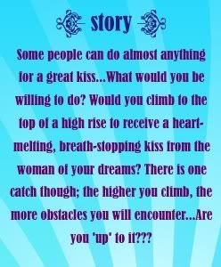
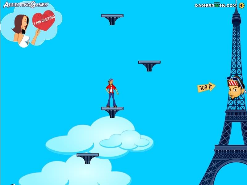
Basically, Woman on Top is another one of those cheap platform type games that have you ascending to a certain height to retrieve some kind of reward. In this case, you climb platforms suspended in mid air until you reach the girl of your dreams, who gives you a kiss for your efforts. Then you do it again.

That's it. That's the whole story. Don't believe me?


Never doubt me again.

I can instantly discern that the developer of this game was a man. A man with no girlfriend. Either that, or he has the most demanding girlfriend in the history of mankind. I love my girl, but if I were to take her on a round the world trip, only for her to climb the nearest monument and demand that I follow her, I'd start having doubts - about our relationship, and her sanity.


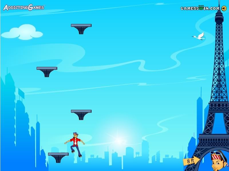
Besides, look at this guy. He is so gay. That's OK, I have nothing against homosexuals, but this guy is obviously in denial. There's got to be a point, when you're climbing the Eiffel Tower, that you just have to stop and say, "Fuck it. You know what? I am gay." This man would have a much happier life if he stopped living a lie.

What struck me as I played this was the laziness of the developers. Your character doesn't even walk - he just slides across the ground like his shoes are covered in oil. Not to mention, if he's standing on a moving platform that happens to be going down, he reacts like he's falling. Does he have vertigo? And she's making him do all of this for a kiss? That bitch!

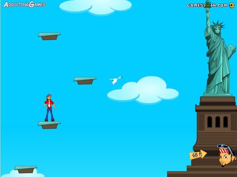
Once you're halfway up, you'll get a neat little message in the corner of the screen:


Oh, I'm sorry, your majesty! I didn't realise climbing a national landmark would take so much time. I apologise for the delay!

Actually, you're not even climbing the monument itself. You're jumping on platforms next to the monument. The locations are just there to help prevent you from realising every level is exactly the same.

As if guiding a slippery closeted moron across platforms wasn't hard enough, everything is out to get you, doing their damnedest to push you off and send you hurtling back down to earth. Blimps, balloons, planes - even birds.


Yeah, that's right. We might say "the birds and the bees" but the truth is, birds are hate-filled, spiteful creatures that seek only to ruin the hopes and dreams of all young lovers. Birds, like robots, are incapable of love, and therefore despise it. So now you know.


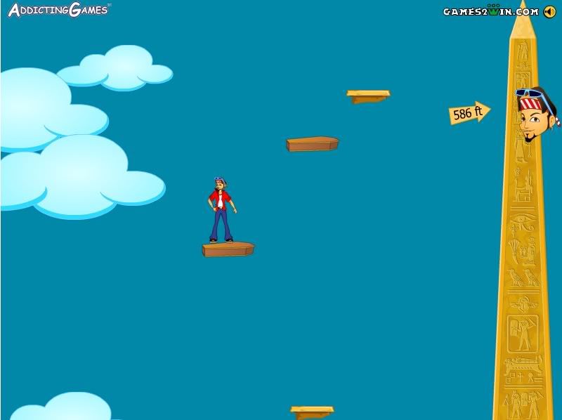
OK, where were we? Oh yeah, the shitty game. Usually the platforms are generic bog standard pieces of free floating earth, but each level has a few specific to the country in which it's based. For instance, check out the moving platforms in Egypt:


Hold on, that just looks like any old Western coffin. Are you trying to tell me it would have been too hard to make it look more like a sarcophagus? But then, considering the developers didn't even give the main character a full range of movements, perhaps I'm asking too much.

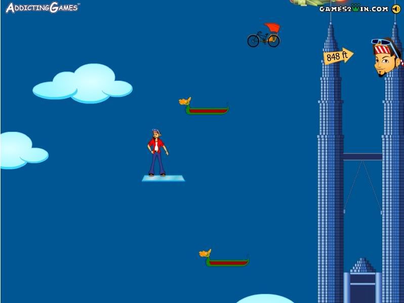
In their desperation, they start using anything they can think of, like taxis on the New York level. Taxis just floating in the sky? Fuck it, I've accepted stranger things. Although I can't for the life of me figure out what's going on here:


OK, the bicycle taxis I can deal with (if I can deal with flying bicycle taxis, I've been playing way too many games recently.) But the gondolas? That building is in Singapore, right? So why are there gondolas on this level? I don't give a fuck if the developers stuck a dragon's head on the end of it, that's a gondola. If they were going for a traditional Thai boat, they should have done a better job. Next time draw better.

Actually, let's not hope for a next time. This game veers from ridiculously easy to stupidly hard within the same level, and quite frankly, a kiss on the cheek from a skinny tramp is not enough motivation to keep me playing. I was happy when I eventually fell off because I realised if I was going to waste my time playing internet games, I'd much rather waste it on something that's good. However, this was not just a waste of my time, but the time of everyone involved in its production. Next time, try not to make something that doesn't stink like a six month old stillborn foetus, OK? Thanks.

Wednesday, December 5, 2007

Plankton Life


Regular readers will notice I did not post a review on Sunday. The reason for this is because I was involved in the Film Racing Grand Prix, which asks that you write, shoot and edit a short film in less than 100 hours. You'll be happy to know that we did it, and if you'd like to check out my weekend's labour, you can watch the video (entitled "One Season Tent") here.

But anyway, you didn't come here to watch hastily-produced short films - you came here to read my rants about shitty flash games! So without further ado, let me tell you all about Plankton Life.

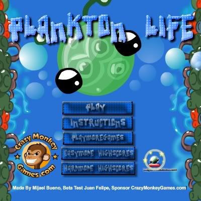
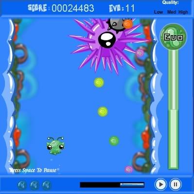
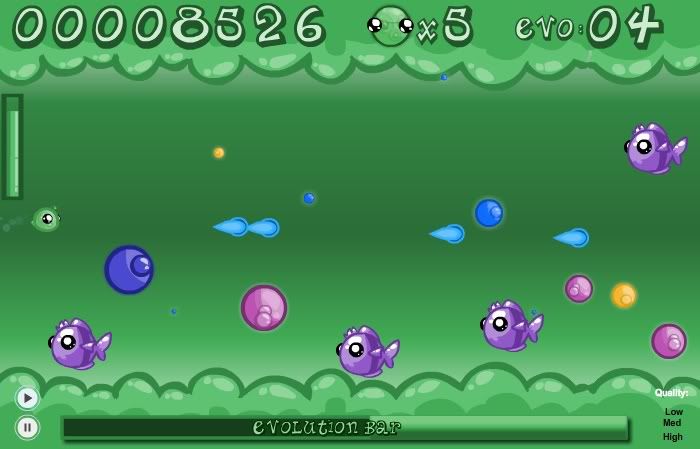
Forget everything you know about evolutionary science - Plankton Life tells you how it really goes down. In this game you play a smal green plankton, and it is your job to evolve into a multicellular being, with a spine and everything. To do this, you eat little coloured balls called Evos (they might just be called little coloured balls, but hell, let's call them Evos.) You collect the Evos while trying to avoid fish and maces.

I shit you not. You have to avoid fucking maces.


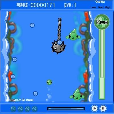
There are hundreds of them, too. Where are these maces coming from? Is there a vindictive fisherman in a boat somewhere dropping medieval weaponry into the sea? I could have let that pass if it was easy to outmanoeuvre the maces, but you have almost no control over your character. The easy option is to use the mouse, so you can click and drag the little sucker around. But here's the problem: if you hit anything - and I mean anything, from the fish and maces to the edge of the fucking screen - the plankton will start bouncing wildly from side to side, getting attacked by everything in its wake.


Mace to the face! Ouch!

Perversely, your character is even less responsive when you use the keyboard. What kind of alternative reality must this game come from, where using the keyboard is harder than using the mouse!?

The pause button is your best friend in situations like this, and I doubt I would have gotten anywhere in this game without it. When you lose control, simply tap the space bar to pause the game, move your pointer over the plankton, and unpause. Otherwise expect to spend many moments cursing at your screen as the little ball of snot bounces off the walls and out of your grasp for the eighth time in twenty seconds.

But I started getting the hang of things. I was avoiding the enemies, collecting my Evos, a developing fins when...


OK, what the fuck is that? Is that... is that a boss? I have no weapons, no way of defending myself, and now I have to face a boss? Who's bright idea was that?

The boss knocks you one way, and then the other, and the depressing thing is you can't do shit about it. All you can do is sit there and take it. If nothing else, this teaches kids a very important lesson - plankton are the prison bitches of the sea.

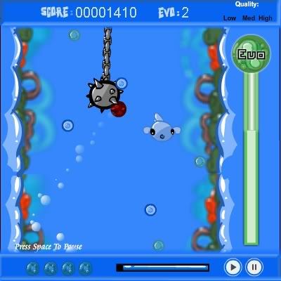
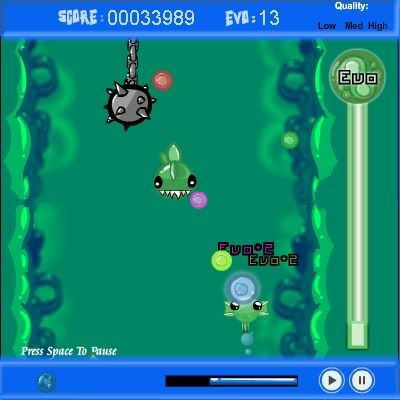
Once the giant spiky thing has had its way with you, the plankton makes its way to level two, where it must faces piranahs:


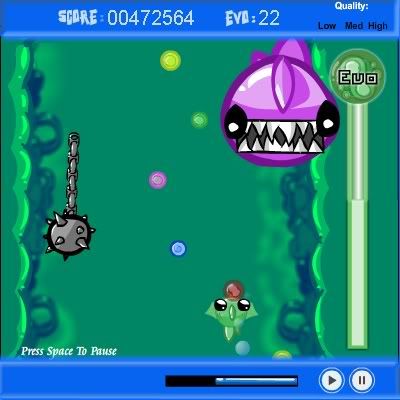
And another big purple motherfucker who pimpslaps you into oblivion.


I could go on, but really there's no point. As the levels progress you get bigger Evos and even egg-shaped things that give you more points, but despite evolving 24 times before I eventually died, my plankton never developed the ability to control his major motor functions. And if you can't control them, you don't deserve a nervous system.

Recently a sequel was released, Plankton Life 2. This has one big advantage over its predecessor - the ability to shoot things.


Yeah, eat my blue lasers of doom, fuckers! Unfortunately, they neglected to improve on the controls, so you'll still bounce around like an ADHD kid whose Ritalin prescription just ran out. Unfortunately, this is not the end of the Plankton games, as a totally new title is available online, similar to its cousins in only two ways - you eat stuff, and it sucks. But that's for another time.